Friday, September 7, 2012

Stamped Gorjuss Girl

In a previous post, I shared some photos of some 'Gorjuss Girls' cards that I had made using a couple of cheap calendars picked up earlier in the year. Well, always one for a bargain, a couple of weeks ago when I went to my local Hobbycraft store, I could be found rummaging through their bargain boxes! Much to my delight, I found some Gorjuss Girl stamps that were around half their RRP. Woo-Hoo! I picked up 3 different designs, 1 of which I have used so far. The card below is made using the 'Purrfect Friend' stamp which is available on www.bubblyfunk.co.uk (although my set had other smaller images as well as the large girl design).
As well as the 'Gorjuss Girl' stamp, I have also used a multi-layered star stamp that is part of a range relatively new to Hobbycraft of their own small acrylic stamps. There are lots of different designs available and they are all just £1 each- they are particularly great for creating your own backgrounds.

I actually started this card by cutting down some white card to stamp the topper onto by measuring the stamp design and then adding a border all the way around. I stamped the design with a Versamark inkpad and then embossed it with a black 'Heat it up' powder. I did this as I wanted to watercolour my design so needed a permanent image and I find that if the image is embossed, then the watercolour does not run quite as much. I used my Anita's/Papermania watercolour pens, putting some of the ink onto an acrylic block and then using my waterbrush to transfer this to the image. This method stops you getting lines on your design as you would if you applied the ink directly to the paper and then tried to watercolour it.

When the image was dry, I used some Stickles glitter glue just to highlight the heart in the girls hair (you can't really see it in the photo though). After more drying time, I then used my 'Dusty Concord' distress ink to change the card from white to purple, while still leaving a white border around the stamped image. The purple stars were then stamped using a Hobbycraft stamp and a 'Grape Jelly' memento ink. I then mounted my topper onto some black glitter paper, using my scissors to scrape away some of the glitter so that my topper would stick more strongly.

The base card is an A4 white card, folded in half and then, again, inked with the 'Dusty Concord' distress ink. I used the same Hobbycraft star stamp to create a background design but this time used a black memento ink for a slight contrast. The card is finished with a small black bow that was originally white and I coloured using my black promarker. I used my heat gun to speed up the drying time of the ink and found that this did shrink and harden the ribbon slightly but it was still ok (could be a nice future effect though!). It just finished the card nicely. I have, however, recently managed to get some small black bows from the Marks & Spencer outlet at the Springfields shopping centre in Spalding, Lincolnshire. They were reduced to £1 for about 25- they are supposed to be as a wedding table decoration but are the perfect size for cards and saves you from spending ages trying to tie a very fiddly bow!

Sunday, September 2, 2012

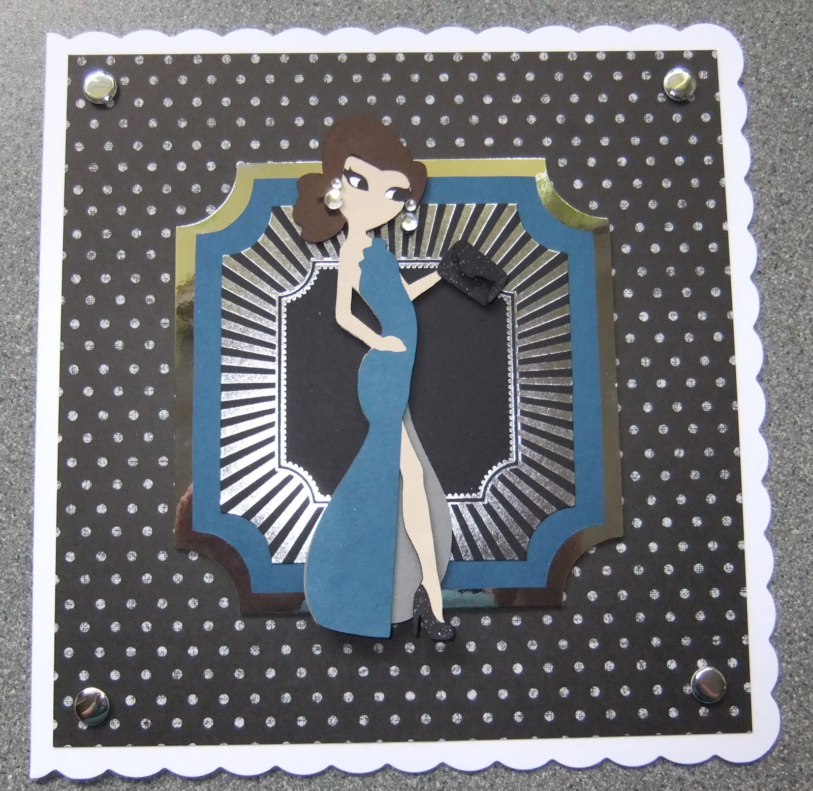
Cricut- Paper Doll Teen Scene

A couple of weeks ago, I posted about a new cricut cartridge that I'd ordered from the Card Craft UK website. Well, here are my first 2 cards made from my lovely new Paper Doll-Teen Scene cartridge.

I've got the other 2 paper doll cartridges and have used them a lot for a long time but the one thing I would have liked from them was for the characters to be a bit more realistic. This is where the newer Paper Doll cartridge is great. There are 2 male & 3 female characters in different poses with about 10 different outfits, hairstyles & accessories per character.

The handbook is set out to try and make the creation of the characters easier by showing you an idea of the colour to use and the layers are recorded in order. This does mean that you have some card/paper waste through the layering but it is easier to follow. I found that paper worked better than card as you do end up with quite a few layers at the end and can have a very thick topper if you use card.


These are the 2 cards that I have made so far, both starting with a Craftwork Cards 8x8 scallop edge base card. The one on the left was inked with new 'Picked Raspberry' distress ink. Both cards were then layered with DCWV papers from 12x12 stacks (teenage dream & la creme). I then used Kanban stackable mats to create the layers behind the characters, inking the pink one, and using a mat as a template to create the blue one to exactly match the colour used in the dress. The card on the right was finished with silver mirror card candi.

Here are the characters in detail


I'll try to explain why some paper is wasted when you make them! You basically start by cutting the entire character (+ fringe) in your chosen hair colour. You then cut the whole body in white, the whole body with eye holes in black and then the whole body with larger eye holes in your chosen skin colour. This is done to create the effect of the fabulous eyelashes which look great, but I think could probably be done without also cutting the legs, arms etc. If I find a way to solve this, I'll blog about it but I am really happy with the results. You then choose your colours for clothes, shoes etc. and layer up the image as shown in the handbook, which is now much more detailed than the old versions.

I've already made up some other characters but just not got round to putting them on cards yet- I'll post them when I do.

Also, the variation of the characters is great and as well as generally girly cards, there are graduation outfits, wedding style dresses & sporty outfits. The male characters include skateboarders, guitarists & sports such as basketball as well as more general gym/weights. There is also a really good one with headphones & an ipod. They will make great cards for those famous 'awkward teenagers' that all crafting companies seem to be going for at the moment!

Thursday, August 30, 2012

Step by Step Cardmaking- Lesson 2- basic card fold

The basic card fold is the staple card fold for a new cardmaker. It's simple but classic. This style of card fold can be used to create a wide range of card sizes but I would start with an A4 sheet of card. I would advise using a bone folder (at the least) and a scoring board if you're serious about this.

If you have a score board, it will more than likely have a mark, showing where to score, for an A4 half fold card. Make sure that you put the short edge of the card right up to the score board barrier so that the card is scored correctly. If your score board does not have any markings, then simply measure the length of the piece of card and mark the card half way along at the top and the bottom. Align these lines to the score board ridge and then score. It's important to measure each piece of card as they can vary slightly each time.

Without a score board, you can still achieve good results but you will need to be a little more careful. It is possible to simply fold the cald in half and crease, but this can cause the edge of the card to crack and leave you with unprofessional results. You can buy a 'ball embossing tool' for a couple of pounds but if you've got an old, out of ink, biro then that will work just as well. Measure the long edge of the card and mark the centre line with a pencil at the top and the bottom. Line up the ruler with those two lines and then use the ball tool, or biro, to mark that line. It's best to go over it 3/4 times just to create a slight indentation.

When you have scored the card, turn it over so that the mountain of the indentation faces up and then crease towards you. This means that the valley aspect of the indentation you made, becomes the outside edge of the card- this gives you the crispest fold. This is where you use the bone folder to run down the edge of the card and make the fold extra crisp.

You can buy pre-scored cards that you simply have to fold but these are more expensive and not available in as many colours as the plain A4 card.

This is a very versatile card fold and below are some examples of cards that begin with that basic fold, in both portrait and landscape orientations.


Sunday, August 26, 2012

Kanban 'Winged Dress' card

When I visited the Kanban outlet a few months ago, I was seduced by a beautiful acrylic stamp set that featured 3 large images of outfits and smaller crowns, cogs & watches. They are in the 'steampunk' style that is very popular at the moment. At the time, I was reading the book 'The Night Circus' and the stamps really made me think of the style described, so well, in the book. The set was £10 and I couldn't resist. This is the first card that I have made using the stamps.


I started with a piece of white card, cutting it to a size that would fit my main stamp image once I had added the wings to the dress (they are 2 seperate stamps). I used my 'pumice stone' distress ink on that white card to give it a vintage look. I was desperate to use my Spectrum Noir alcohol inks so I started by stamping the dress in a brown memento ink so that it would not bleed when I used the pens. As I wanted to add the wings, from another Kanban stamp set bought at the outlet, I stamped the middle part of the dress onto a sticky/post-it note to act as a mask. I placed this mask onto my initial image and then stamped the wings over it again using the brown memento ink.

I then wanted to colour my image (using my spectrum noirs) and chose a deep green colour. I have been practising my shading with the pens but I didn't feel that I had a colour close enough to the original one I wanted to use. I therefore decided to just use the one pen and build up the layers to create the shading. I started by colouring the whole dress so it was a flat solid colour and then used the same pen to go over the lines provided by the stamp and the shadow areas underneath the folds of the dress. It created a very good shading effect. I repeated the same technique on the hat using a brown pen and the flower on the hat in the same green one.

I was keen to foil the wings just to add a different colour and texture to the card. I did this by picking out parts of the image with my quickie glue pen and then using some gilding flakes to add a range of colours to the image. This is a really simple technique and one that I've really got into since getting some bargainous rolls of foil again from the Kanban outlet. It's a great way to tart up a cheap topper! You can see that in detail below-


I then used the small crown stamp, from my clothes stamp set, with the 'pumice stone' distress ink just to start to add some detail to the background as it looked a but plain. I wanted some of the images to seem as if they were partly behind the dress so I again used my mask to create that effect. I then used the cog stamp with the brown memento ink to add a different shade to that background. I then used the same memento ink to edge the topper piece.

I mounted my topper onto a piece of dark, earthy green card showing a 0.5cm border on each side. I then attached this to a, once white, A5 card front that I had distressed using the same pumice stone ink and crown & cog stamps. The only addition on the card base is that I also added a few splashes of alcohol ink in a range of brown shades- this probably wasn't a great idea, in hindsight, as the alcohol ink does bleed through the card quite a lot so I'll need some sort of cover/insert on the inside. Not exactly a 'happy accident' so much as a mistake!

Crafting in Kent

I spent a couple of days in the lovely county of Kent last week and of course, made it my mission to hunt out all of those fabulous craft shops. We were focused mainly around the Dover area so my craft hunting was slightly limited as I didn't really realise that Kent was such a large county.

I, unfortunately, have just one craft shop to report on and that is Rainbow Crafts in Herne Bay (http://www.rainbow-craft.co.uk/). The shop was on the high street, which itself is just off the main sea front. and was BIG! Definitely worth a sneaky visit if you can convince the family that a day out at the seaside is a good idea. Large shop, with lots of goodies including docrafts, distress inks, scrapbooking papers & lots more. They looked to have an area for workshops too within the shop.

Not a place to make a special trip for, as the range was nothing out of the ordinary, but worth a look if you're nearby or there on your holidays.

Thursday, August 23, 2012

Kanban outlet

Whilst looking through my various blog posts, I realised that I've mentioned this place a few times in passing but for some, deeply unknown, reason have never given it a blog post of it's own. This is a huge mistake as anyone who has visited before will know.

I first visited on the way back from a wedding that was roughly in the Shipley area and now go back at least once a year even if it means a special trip. It is well worth the petrol it costs to get there.

For those people who have only been familiar with Kanban since they have been part of the Create & Craft family, you've not even seen 10% of what they have to offer. When Kanban were a large part of the QVC craft line-up, they bought out new products much more regularly and had a much wider range.

The outlet shop is a mecca for all Kanban fans!

It is in Shipley, West Yorkshire and is a little difficult to find (don't trust an AA route map) but it's worth the effort. It has changed every time I've been so it may be different to my description when you go (which you should) but it will still be awesome.

The shop is split into 2 rooms. The first houses the 'expensive' side of things- you'll see why that's ironic in a minute, and this leads through to the bargain bargain room! The second room is full of large shelving units that house all manner of 'seconds' which essentially means the start and end of a print run. This means that the topper sheets are not die-cut and not foiled or glittered. You do have to search through everything and pick out the good stuff but you will find some real treasures. Some of the items are printed on 2 sides but if you're cutting out a topper and sticking it onto a card then you'll never see it anyway. There are usually some good background cards and if you're really lucky envelopes & some foiled pre-scored cards. It is very much hit & miss and you'll never get the same things twice but I've never been disappointed. When I last went in May, this room had a 'fill a box' system with each box costing £9 and probably holding about 100 A4 sheets. If you bought 2 boxes though, the 3rd was free. that means you're getting around 300 sheets for £18. That makes each sheet just 6p! That is truly unbeatable. Even if you only manage to get 1 card out of 2 sheets then you all know that's a bargain- even by the time you've added your own glitter (or foiling as I'll explain in a minute!). This is why the first room seems 'expensive'! The major things I got this year were part of the new London themed images and I got way above the full kit amount for a lot less than it cost- yes I need to cut them out but that's worth the savings.

The first room starts with a counter that shows all of the acrylic stamp sets they sell. These are sold at retail price but they are still great value. This room also has topper sheets but these ones are perfect (die-cut, foiled & glittered) for 20p or 30p each. This is even cheaper than buying them in bulk set from a shopping channel and you only buy the designs you like. They are mostly older designs but the new designs are available to buy too (but for RRP). There are also out of season bargains to be had e.g. 10 Christmas decoupage sheets for just £1. You can sometimes get ex-QVC kits too at major reductions. My favourite part is the foil rolls though (this is what I meant about adding your own foiling). You can get a huge roll of coloured foil (probably close to 100m) for £2/£3. As long as you've got a quickie glue pen then you can foil the sheets from the 'fill a box' room for yourself. 1 roll will last for years but when you see all the different colours (much more than just gold & silver) then you'll end up with at least 5! You can also pick up background cards, printed acetates, glitters, envelopes & ribbons all for great prices.

No matter where you live in the UK (or Europe & maybe even the US) then you need to visit the Kanban outlet. You'll probably never use all the stuff you get but you'll still go back for more. It becomes an addiction!

Prepare to be there for at least 4 hours (if you're going to do it properly) and make sure that if you take a non-crafting person with you, they take a book/ipod/ipad to keep themselves entertained. There is a sofa and free tea/coffee making facilities provided!

Skater Boy

Back in May, I picked up a reduced price stamp from one of the stands at the Sincerely Yours papercraft show in Lincoln. It was in a design style that I'd not seen before but knew instantly was just my sort of thing. It is by a company called 'The Greeting Farm' who are US based but they are available on a few UK websites (unfortunately I have no idea who I bought it from). The stamp is called 'Skater Ian' and is part of a range called 'Anya & Ian'- a set of boy & girl stamps in various situations e.g. surfer, teacher, wild west etc.

This is the first card I've made with the stamp and found it a great design to decoupage and a great opportunity to use my Spectrum Noir pens properly. Decoupaging the design meant that I had some extra unseen pieces to practise on too!
I stamped the image 4 times using a black Memento ink so that it would not run as I used my Spectrum Noir alcohol ink pens. I tried out various colour combinations and blending techniques on the lower hidden layers until I was happy to work on the layer that would be seen. I found it easiest to blend the colours by covering the whole area with the lightest colour first and then using the 1 or 2 darker shades to put in the shadow. After colouring, I cut out and layered up the image using foam pads (poundland special!).

The backing paper is from the 'Teenage Dream' stack by DCWV and already had a skater image inside the shield design, where I placed my topper. The backing paper was a flat design so I used my Sakura Clear Glaze pen (#800) to go over the multi-coloured shield image just to lift it slightly.

A simple card but the fabulous stamp makes it different to many other cards out there. Definitely a range of stamps I'll be looking out for again.